The garden is more than just an outdoor space; it is an environment where nature can manifest in all its splendor, offering beauty, tranquility, and a complete sensory experience. One of the main aspects that contributes to a garden’s harmony is the combination of colors and textures of plants. These two elements play a fundamental role in landscape design, creating atmospheres that can range from vibrant and energetic to calm and relaxing. The art of choosing the right plants and arranging them in a way that their colors and textures complement each other is a true challenge for anyone seeking to create a visually balanced garden.
When exploring the impact of colors and textures in a garden, we can see how these characteristics influence the perception of space, transform the environment, and even affect our mood. In this article, we will discuss how these two characteristics interact in landscape design, how to use them to create harmonious and balanced combinations, and how to make these choices in a way that favors both the beauty and functionality of the garden.
1. The Importance of Colors and Textures in Garden Design
The conception of a garden involves careful analysis of both aesthetic and functional aspects. The colors and textures of plants are the main factors responsible for conveying the desired feeling in our space. They are not limited to just visual aspects; they also create a psychological impact that can alter the perception of the environment. Therefore, garden design is not only about choosing beautiful plants, but about creating a cohesive whole in which all the choices complement each other.
The Impact of Colors on Garden Perception
Colors are perhaps the first element we notice when entering a garden. They are powerful in conveying immediate sensations, such as freshness, warmth, tranquility, or excitement. In landscaping, colors can be used to draw attention to certain points, such as paths or focal areas, or to create a soft and serene background, as in the case of green foliage and soft flower colors.
Warm colors (red, orange, yellow) are perceived as energetic and stimulating. They attract the eye and can be used to create a focal point or a center of interest in the garden. Cool colors (blue, green, purple), on the other hand, are associated with calmness and serenity. They have the ability to visually expand a space and create a feeling of tranquility.
The Role of Textures in Garden Design
While colors attract attention and set the visual tone of the garden, textures add depth and softness. Texture is the tactile and visual sensation that plants and their elements provide to the observer. Plants with broad, round leaves, for example, have a different texture from those with fine, pointed leaves. By combining different textures, the designer can create a more dynamic, interactive, and visually interesting garden.
The interaction between colors and textures is one of the keys to creating a harmonious garden. Balancing these characteristics is what will make the garden appear cohesive and well-planned. The creation of contrasts, such as combining a plant with vibrant flowers and one with delicate leaves, can create a sense of movement and vitality. Meanwhile, mixing plants with similar textures can bring a sense of tranquility and unity to the space.
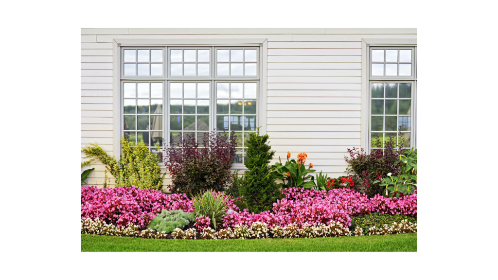
2. The Role of Colors in the Garden
Color in the garden is not limited to flowers. The leaves, trunks, and even the soil can contribute to the color palette of the environment. Each part of a plant can have a shade that alters the dynamics of the space. Therefore, the combination of colors should not only consider flowers, but also the entire plant, including its root system, stem, and leaf shape.
How Colors Affect Space Perception
Colors can make a space seem larger or smaller, warmer or cooler, cozier or more expansive. For example, in a small garden, light colors such as white, soft blue, or lilac can be used to create a sense of spaciousness. Darker colors, such as dark red or deep purple, tend to give a feeling of coziness and can be used to create a more intimate environment.
The use of warm colors in central areas can draw attention and create focal points in the garden. Cool colors, in contrast, can be used in the background to create a sense of depth and visually expand the garden.
The Effect of Colors on Emotions and Feelings
Each color has the power to evoke different emotions and feelings, and this can be used to create a specific atmosphere in the garden. Green, for example, is a color associated with nature and balance, bringing a sense of calm and relaxation. Blue, on the other hand, is often related to the sky and the sea, evoking feelings of tranquility and peace.
Red and orange, meanwhile, are colors associated with warmth, passion, and energy. These can be used to add dynamism to the space, creating vibrant areas that draw attention. Neutral colors such as white, gray, and beige are versatile and can be used to balance the intensity of more vibrant colors, providing a sense of sophistication and harmony.
3. Colors in the Garden: How to Choose and Combine
Now that we understand the importance of colors in garden design, the next step is to learn how to effectively choose and combine these colors. A well-chosen color palette can transform the garden, creating a visually balanced and pleasant environment.
Choosing the Garden Color Palette
When choosing colors for the garden, it is important to consider the desired landscaping style, the region’s climate, and even the architectural style of the house. In more modern and minimalist gardens, a monochromatic palette or a combination of neutral tones can create a clean and elegant effect. In more exuberant and romantic gardens, a mix of warm and cool colors can be used to create an enchanting garden effect.
Plants with colorful foliage should also be considered when selecting colors. Many plants have leaves in shades of purple, bronze, or red, and these colors can be combined with flowers that complement these hues. The key to choosing the right palette is ensuring that the colors of the plants complement each other without creating an overbearing or chaotic environment.
Combining Complementary and Analogous Colors
A common technique in garden design is the combination of complementary colors. Complementary colors are those opposite each other on the color wheel, such as red and green or blue and orange. These combinations create striking contrasts, drawing the eye to specific areas of the garden.
Analogous colors, which are next to each other on the color wheel, create a smooth and flowing harmony. Combinations of colors like green, blue, and purple or yellow, orange, and red can be used to create smooth transitions between plants and generate a more tranquil and serene effect.
The Importance of Contrast and Harmony
When combining colors, it is essential to balance contrast and harmony. By contrasting complementary colors in specific areas of the garden, you can draw attention to key points. Softer combinations, such as analogous colors, help soften the garden’s appearance, providing a sense of fluidity and naturalness.
Contrast can also be used to create depth. By using darker colors along the edges of the garden and lighter colors in the center, you create the illusion of a larger space. This is particularly useful for small gardens or more compact areas.
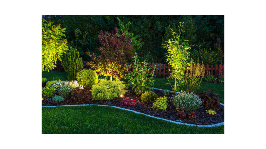
4. Textures in the Garden: The Visual Touch of Plants
Textures are what bring complexity to the garden, transforming the visual surface into something more interesting. They can be used to soften or intensify the sensation created by the colors and are essential for creating a visually dynamic garden.
Types of Textures and Their Effects in the Garden
Textures can be wide and varied. Large, soft leaves, like those of ferns, convey a sense of delicacy and smoothness. Meanwhile, leaves that are harder and spiny, such as those of cacti and succulents, have a rough and sturdy texture, giving the environment a feeling of strength and structure.
Plants with varied textures can be grouped to create interesting contrasts. For example, combining plants with fine leaves and plants with thick, rough leaves creates a visually interesting dynamic that is both engaging and balanced. In larger gardens, this texture diversity can be used to guide the eye and create highlight zones.
Combining Textures Harmoniously
Just like colors, textures can be combined harmoniously or in contrast. In a soft, tranquil garden, for example, plants with smooth, rounded textures can be grouped together to create a sense of cohesion. In more dynamic and modern gardens, contrasting textures, such as fine leaves against thick, spiny foliage, can create a sense of movement and energy.
5. Planning and Combining Plants
When planning the combination of colors and textures in a garden, the key is to consider both aesthetics and functionality. Landscape design should not only be beautiful but also practical, taking into account factors such as climate, sunlight, and plant maintenance.
How to Create a Harmonious Garden Design
Creating a harmonious design requires combining colors and textures in such a way that all plants and elements work together. This may involve using complementary or analogous colored plants with textures that complement or contrast in interesting ways.
Organizing Plants in the Space
When planning a garden, it is essential to strategically organize the plants. Larger plants should be placed at the back or around the edges, while smaller plants can be used to fill the intermediate spaces. Additionally, plants with vibrant colors can be used to create focal points, while plants with soft foliage can be used to create a calm foundation.
6. Practical Examples of Harmonious Plant Combinations
To illustrate how colors and textures can be effectively combined, consider the example of a tropical garden. In this type of garden, the use of warm colors such as orange and red can be paired with the deep green of tropical leaves to create a vibrant and welcoming environment. Plants with large, broad leaves, like banana plants, can be complemented with delicate flowers in soft hues, such as pink and purple, to balance the intensity of the warm colors.
Another example would be the use of blue and green plants to create a calming and relaxing garden. Plants like lavender and rosemary, with their fine leaves and soft flowers, can be paired with dense foliage plants like cypress to create an interesting contrast that also offers a sense of serenity.
Conclusion
Creating a harmonious and balanced garden requires careful attention to the colors and textures of plants. By understanding how these elements can work together, it is possible to create a space that is not only beautiful but also emotionally engaging and functional. Garden design is an art that requires practice and patience, but the results are rewarding. Every plant, color, and texture plays an important role in constructing an environment that reflects nature and provides us with moments of peace and contemplation.